Procrastination kills productivity. I realize how obvious that sounds, but for those who procrastinate, this simple realization changes everything. Emptee is my attempt to assist in the breaking of bad habits and cultivates the need to progress. This was my DevMountain project to familiarize myself with UI/UX best practices. And boy did it! We meticulously went over every step in the process and how it applies in the real world. This project became a great asset in my understanding the importance of UI/UX.
Problem
If we are not individually progressing as humans, we are inevitably regressing. Procrastination breeds regression in all aspects of our life. In order to break the procrastination habit, real change needs to happen. Steady progression in productivity slowly turns into substantial growth and new habits are formed.
Solution
Create a platform that creates a small amount of healthy stress while psychologically rewarding the completion of tasks. I understand that I just describe a basic task oriented app. However, there are elements here that separates emptee from the rest. This is not a to-do app to kill all to-do apps. This is a stepping stone in creating the habit of becoming more productive in everyday things. Staying on top of the small things helps the big things get done.
RESEARCH
I primarily interviewed two types of people; those who procrastinate, and those who repeatedly stay productive. We discussed motivations, fears, and how they keep track of what they need to do. What I found was those who stayed productive constantly kept track of what they needed to do. Kind of obvious, right? They also got a chemical reaction in the brain when they checked something off. In no way are these scientific breakthroughs. However, they did give me great insight on what could make a successful app.
Opposite of this were those who constantly put things off. Most of their motivation came from anxiety and fear; fear of forgetting something, fear of not getting something done on time, etc. There was always a desire to change and become more productive. THIS. This is what I wanted to focus on: the desire to change.
Value Proposition
With my research findings I created a value proposition to further direct decisions.
The Challenge
An app was not going to make people change. REAL change needed to come from within. My goal was to have my app intersect with the user’s desire to improve. A catalyst, if you will.
Theory
There is a common illustration of how to prioritize things in your life. Imagine your important tasks being represented by stones and your menial tasks represented by sand. If you pour your sand into a jar first, the stones end up not fitting. Now reverse that and fill the jar first with the stones, or important tasks. If you then pour the sand into the jar, they will fill in the gaps surrounding the stones. This is the theory behind the app.
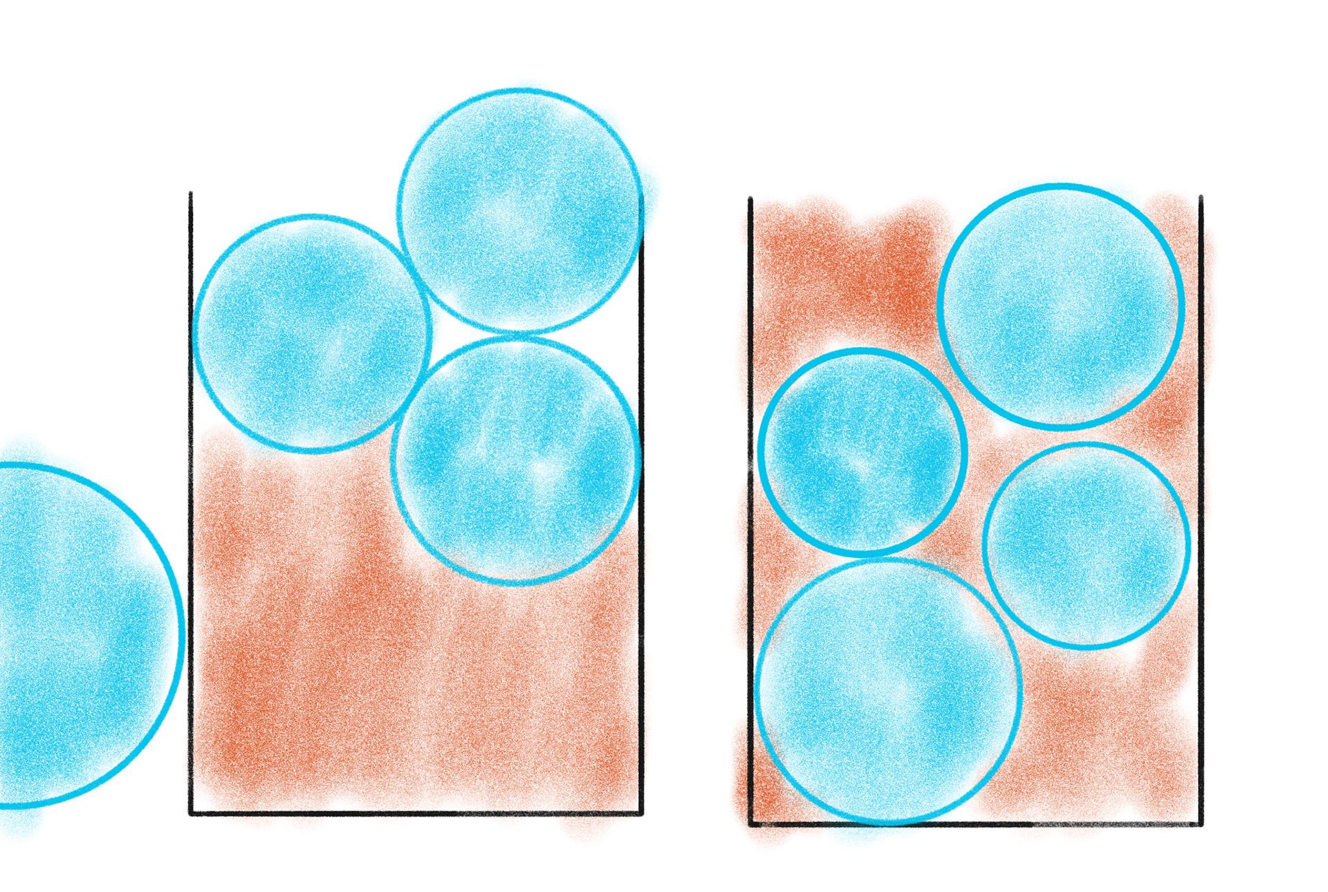
Left: Nothing prioritized. Right: Most important first.
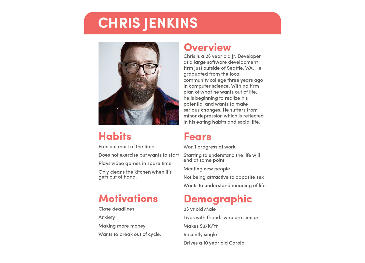
USER PROFILES
The following persona helped guide my decisions.
Execution
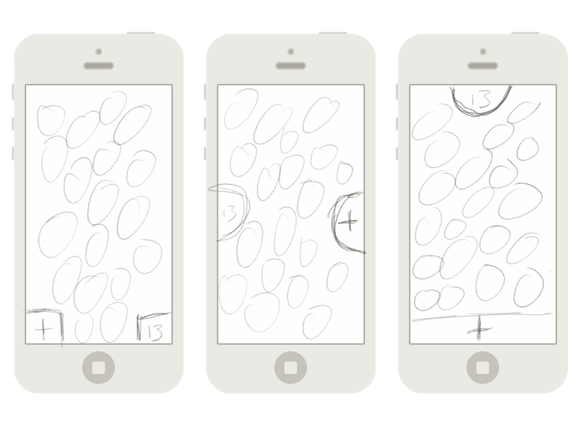
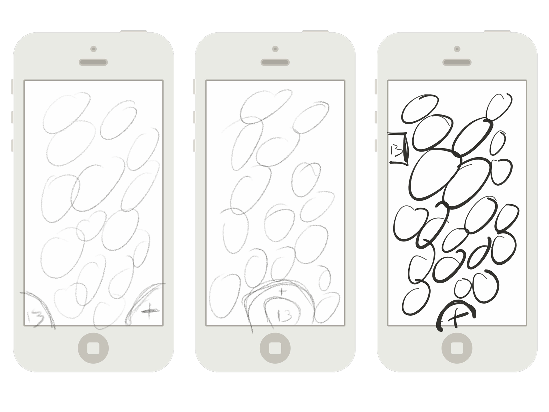
Sketches
There were a few key decision points that needed to be made early on: How complex do I make the app? Should I add gamification? Do I create a web portal, account, and cloud system? Through sketching, I began to peel away the unnecessary bits to create something that was both accessible and friendly.
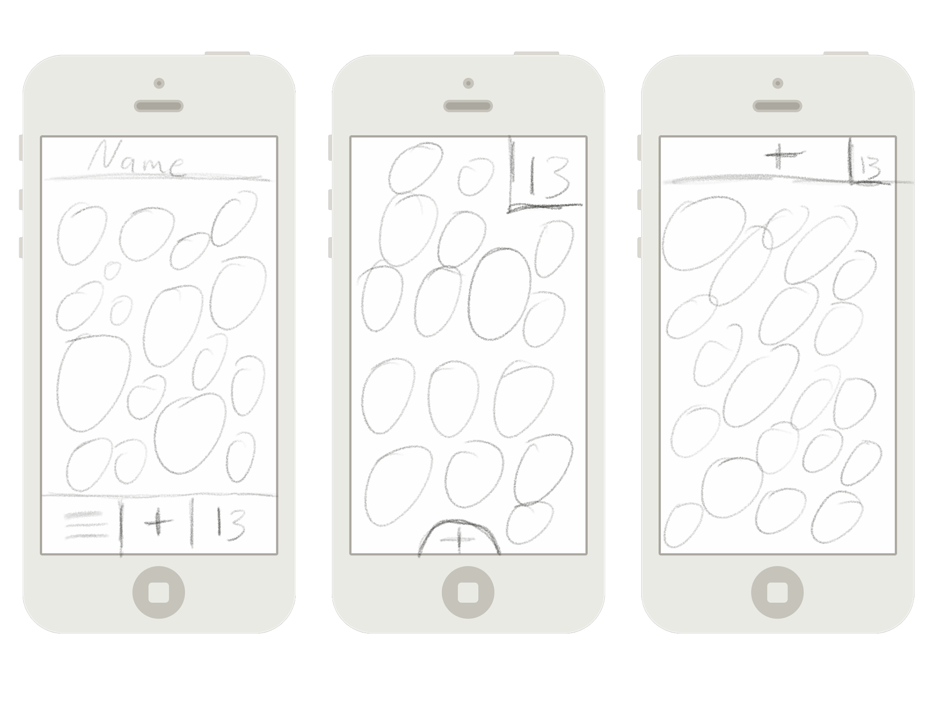
Wireframes
I explored a couple different options for navigation through the app and ended up on one that left a lot of whitespace around buttons. Ease of use is key here so the buttons had to be appropriately sized.

Prototyping
I wanted to make sure things interacted appropriately. Pulling the art into Principle, I was able to solidify interaction between buttons and elements. I quickly learned that a couple of the buttons were too small and that I had to tweak some colors. I do wish I was able to do some more robust testing.
Elements
There were some key points from the interviews that stuck with me. One was that anxiety ended up being the main motivation to accomplish a task for procrastinators. Another was that ease of use was imperative in a task-keeping app. If there was any sort of unnecessary bells and whistles, the user would just give up. Below are the ways these were addressed:
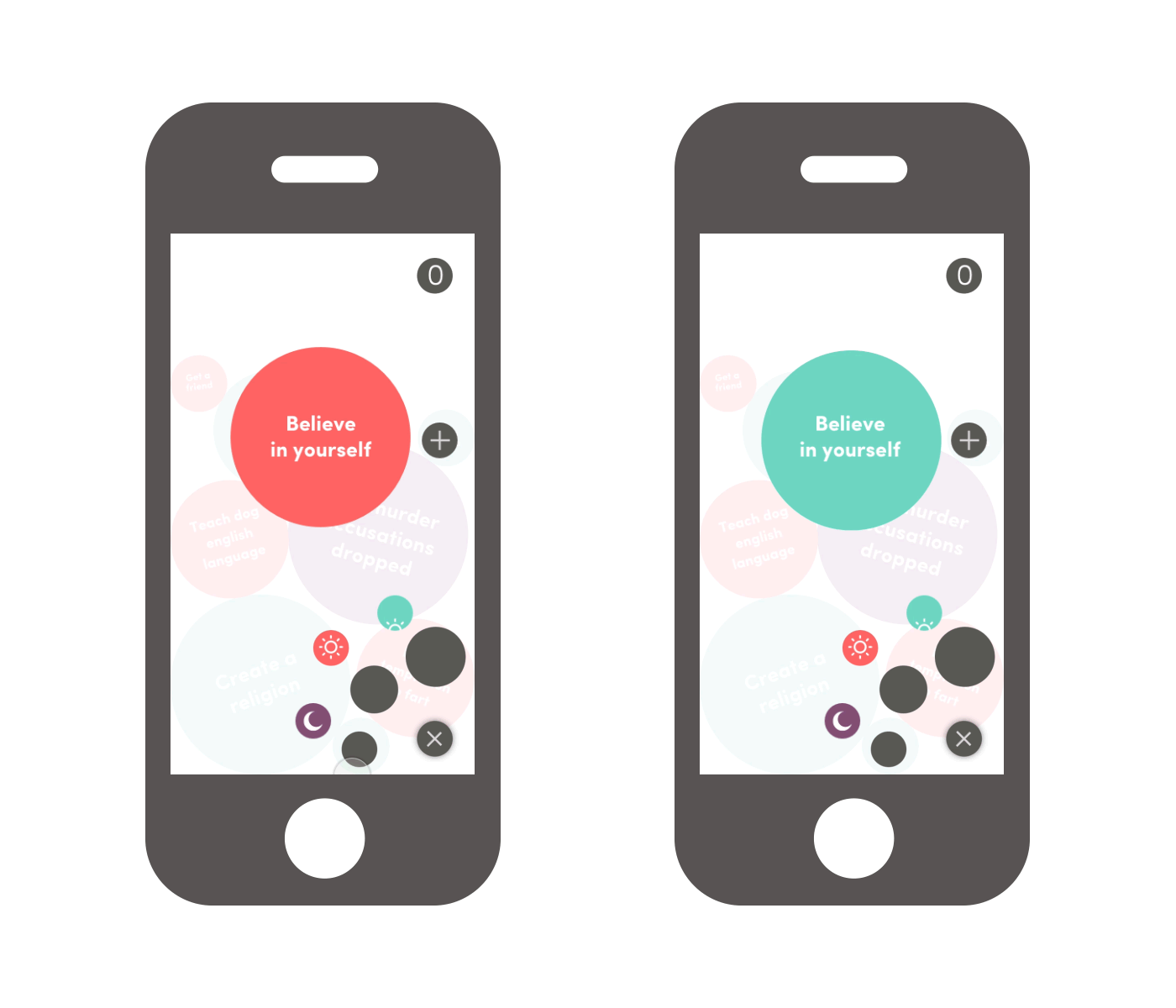
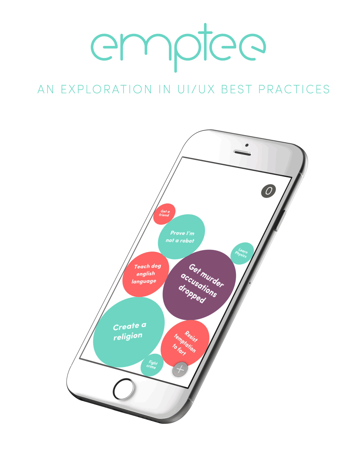
The left illustrates the “stone & sand” simile from before. The user can assign a priority to a task. The more important the task is, the bigger the circle. This way, the smaller circles can fill in the gaps.
The right demonstrates the ability to change what time of day the user wants to accomplish the task: morning, afternoon, or evening. This isn't a planner app so I didn't want them to have the ability to assign a specific time.
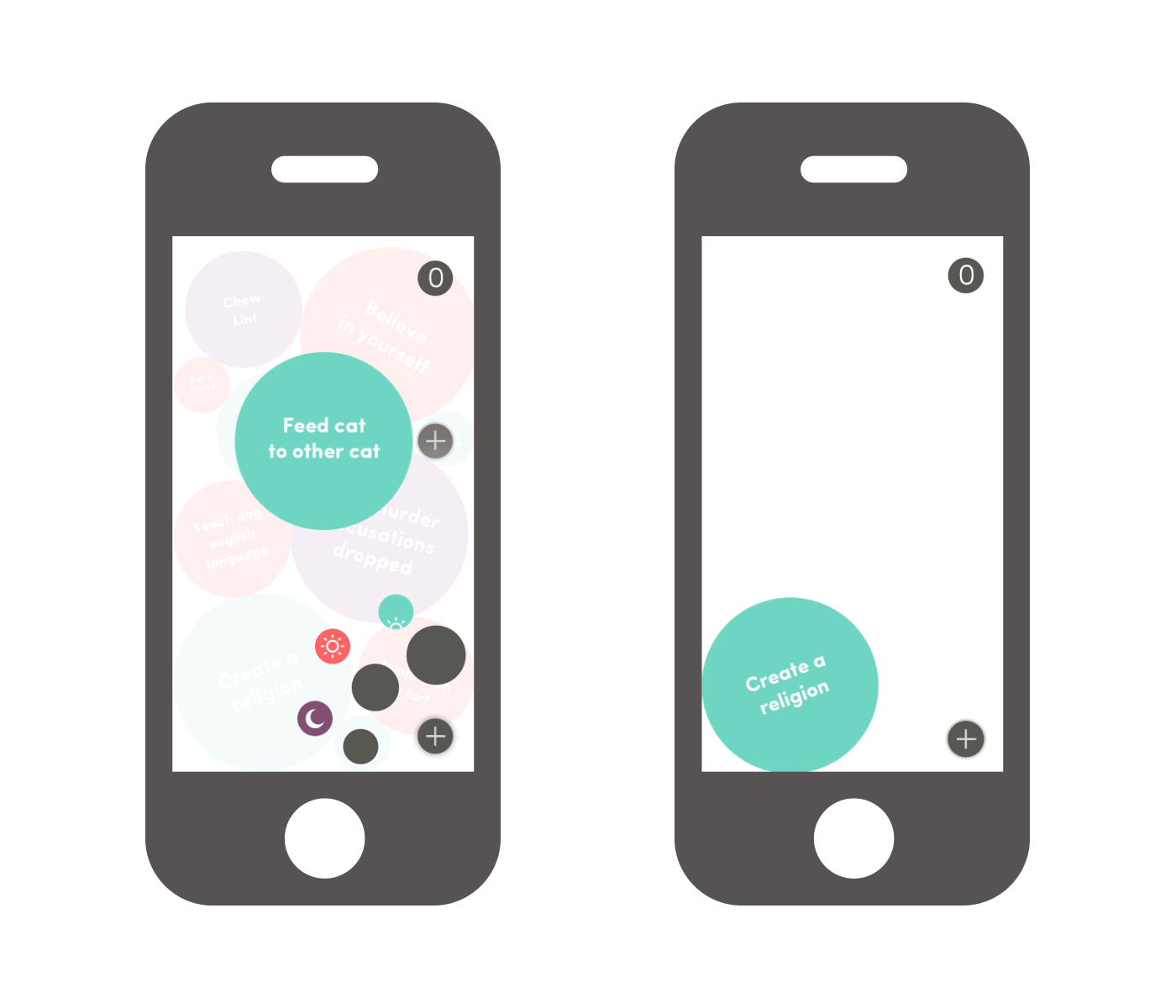
In order to create a productive amount of positive stress, there is a counter on the top of the screen. If there are too many tasks on one screen, when a new one is added it will move up into the queue. The tasks in the queue cannot be seen and will fill the screen once there is room for it. The whole goal of the app is to first keep your queue at zero, and ultimately get your screen to empty. When you do get an empty screen, a nice little quip is there to congratulate you.
Branding
As previously stated, the point of the app is to create a habit of productivity. The user’s goal is to get to an empty screen. Hence the app name: emptee.
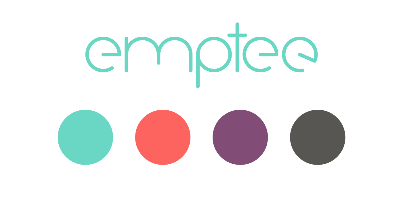
The wordmark is set in an original typeface I made specifically for this. I wanted something smooth, round, and approachable. I couldn’t really find something that fit it exactly, so I made one. The colors used are both calming and invigorating.
UX Debt
While this was a great introduction to UX/UI for me, there are definitely things I would improve for this project.
First, There would need to be a way to edit existing tasks.
Next, what if there was an urgent item that had to be done before everything else? I was thinking there could be a way to shove the task up from the bottom, placing some tasks in the queue.
Next, colors. I would change the red to something a little less fierce. People are expecting the red tasks to be urgent, rather than represent “afternoon” like it does now.
These are just a few ideas and there are a lot more to make this a more robust experience. However, this project did serve its purpose in teaching many of the UX/UI fundamentals.